Changing the color of a single series inside of a chart or graph in Microsoft Excel is something that most people working with charts and data for presentations need to do at one point or another. Luckily it’s very simple once you know how. The problem starts because common sense would lead us to believe that the first place we should check would be in the Chart Settings area, and that’s a mess of settings that are very tedious to play around with. But, there is a much easier way!
Step 1 – Pick a Chart to Change
You’ve probably already completed this step, but the first thing that you need to do is open your Microsoft Excel file and figure out which chart or graph you would like to change. In our example we are just using our Trade Show Checklist. This same technique works in all charts and graphs as far as I can tell. Line graphs, bar graphs, pie charts, stacked charts, area charts, etc.. It should also work with any version of MS Excel that you are using, but please let me know in the comments below if you have an older version that it doesn’t work with. I’ve tested this on Excel 2003, Excel 2007, Excel 2010, Excel for Mac 2011, Excel 2013 and the version included with Microsoft Office 365 (Including the online version). Enough with the technicalities, lets move on to the reason why you came and learn how to change the color of a series in Excel.
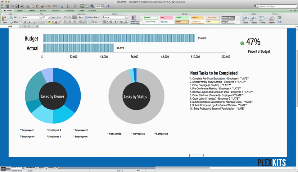
Step 2 – Single Click Anywhere in the Chart Area
Click anywhere in chart area to select the entire chart object. You will notice that all sections of the Excel chart are now highlighted.
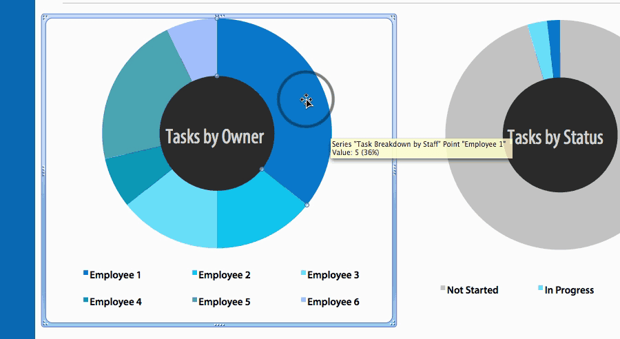
Step 3 – Single Click on the Series you would like to Change
Click on the exact series of the chart that you would like to change the color of. Once you click on it, you will notice that now just that section of the graph is highlighted.
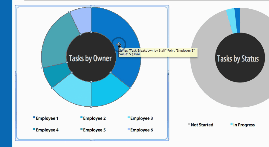
Step 4 – Select the New Color of Fill

Simply go up to the menu bar and click the Fill Bucket and select whichever color you would like to change the chart to. See, I told you it was simple! That’s all it takes to change the color of a series in a chart in Excel. Repeat on all series you would like to change. If you are trying to make your charts look good and need some ideas in terms of colors, check out Kuler a great tool from Adobe to find color schemes – https://color.adobe.com/explore
You’ll notice that the color in the legend also updates automatically.
Well there you have it. I hope that helps you change the color of a series in Excel. If you have any questions, feel free to leave them in the comments below.





18 thoughts on “Change the Color of a Series in a Chart in Excel – How To”
Amazing information Rick. Definitely it will work for me.
Thanks.
Thanks Raj! I’m glad I could help!
Could I do it in auto?
I want to make color change with digital of the same column.
Thank you for your clearly sharing.
It help me a lot !
Hey,
Not sure I completely understand your question. What do you want to automate? Changing multiple charts to have the same color scheme?
I’m trying to make 2 different types of charts have the same colors for the same series and points.
My legends in each chart have the same info but I cannot figure out how to make the colors the same in each chart.
chart 1 = bar graph, legend is points “back, bruise, cut, foot…etc”
chart 2 = stacked bar graph, legend series is “back, bruise, cut, foot…etc”
So, I want “back” to be red in both charts, “bruise” to be blue in both charts…etc..
help!
Hey Jen,
I just dropped you a quick email. If the chart doesn’t have any confidential data on it, feel free to send it over an I’ll take a look.
Cheers,
Rick
Hi Rick,
I want to do what Jen wanted to do but I don’t see your reply on the how to.
This does not work when I try it. when I change the color of a series for a doughnut chart, I expect all the regions for that series to change as well, and they do not. This happens if I try to do it in the legend or otherwise, but does not happen for regular pie charts. Help?
Hmm, I’m not too sure. If the spreadsheet doesn’t contain any confidential information, feel free to send me a link to it using our contact form and I can take a look.
Do you believe that’s a lot tougher than it sounds?
Do you mean changing the color of a chart in Excel or shady SEO tactics?
I removed your link, but thanks for trying! ?
This website definitely has all of the information I needed concerning this subject and didn’t know who to
ask.
Ok, this is for kids.
Now let’s get serious: in a chart with 80 near-similar lines that have quite similar values and therefore are crossing each other, how do you select a single line in order to change its colour?
Haha that’s quite a few. I’d probably think about changing how you display that data.
Hi all/Rick! I’ve created my graphs and when I upload these workbooks to our company Sharepoint page, the (adjusted) colours of my pie charts default back to a standard Excel theme. Is there are a way of locking in the formatting of a graph so that it doesn’t change once uploaded to Sharepoint? Thanks in advance!
Hey Sam,
Thanks for checking out the post. That’s a really good question, I actually haven’t used Sharepoint in years, but I do remember having trouble. Do you have access to the theme/settings in your Sharepoint? I remember a lot of the templates being locked to certain styles and sometimes, only the admins had the ability to adjust it. Let me know! Cheers!
Thanks so much.
The steps and explanations are so easy to follow.
My pleasure maureen! So glad it helped!